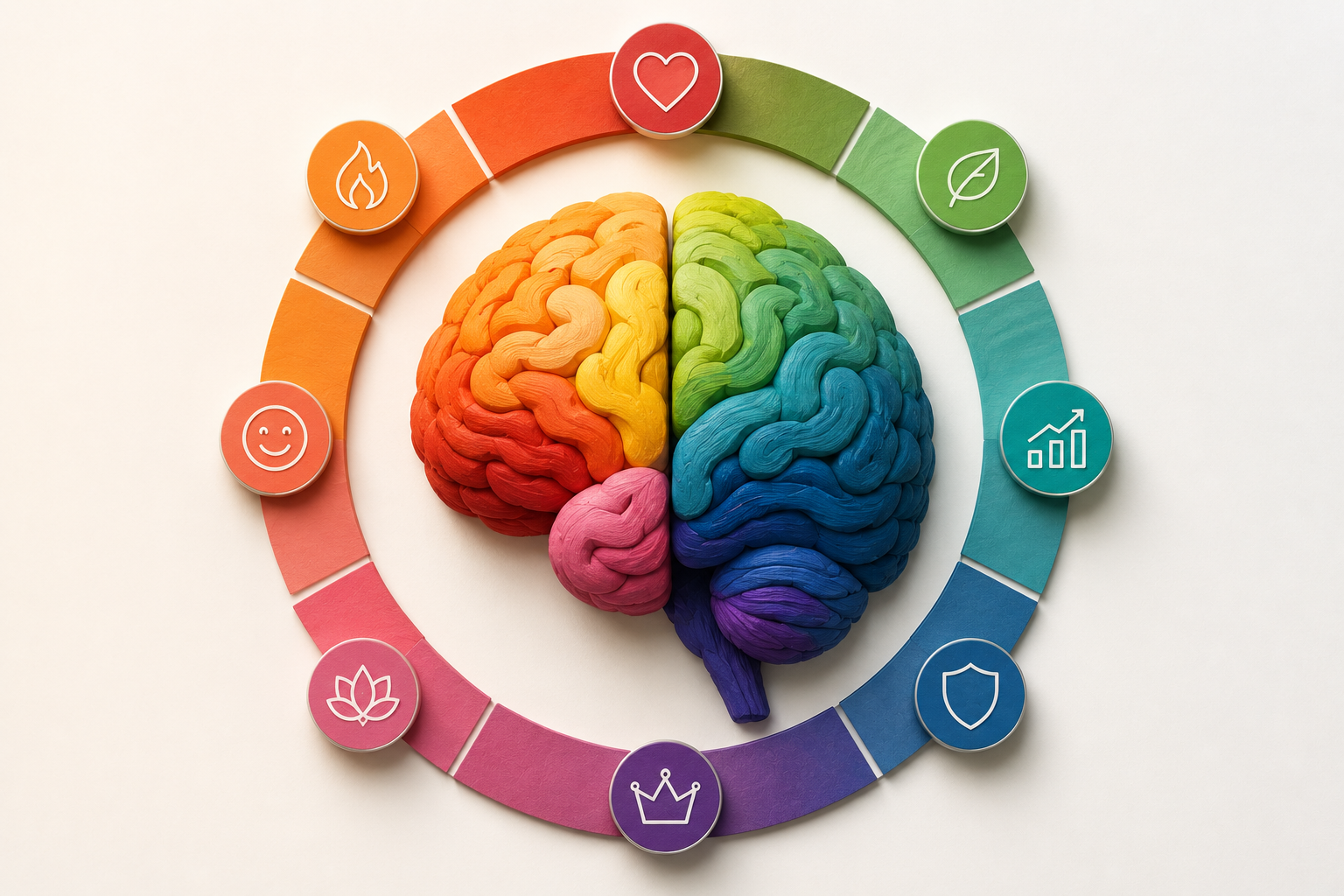
Colors are fundamentally not just elements of visual aesthetics or decorative choices; they are incredibly powerful psychological triggers that communicate directly with the primal, subconscious sectors of the human brain. Decades of neuro-marketing research have conclusively proven that up to 90% of a consumer's initial subconscious assessment of a product or brand is based entirely on its color. The specific color palette you choose for your corporate identity acts as a silent, universal language that tells your customers exactly who you are, what emotional state you want them to experience, and the intrinsic value you offer, long before they ever read a single word of your advertising copy. Mastery of color psychology is not merely an artistic endeavor; it is one of the most vital, data-driven components of a highly converting branding strategy. By understanding the profound cognitive associations linked to different hues, saturation levels, and color combinations, brands can systematically engineer consumer behavior, accelerate trust acquisition, and dramatically amplify their market positioning.
1. THE AGGRESSIVE ENERGY AND URGENCY OF RED
Red is the most intense, physiologically stimulating color in the visible spectrum. When the human eye perceives red, it triggers an immediate biological response: it measurably accelerates the heart rate, elevates blood pressure, and stimulates the adrenal glands. Psychologically, red represents extreme passion, boundless energy, excitement, danger, and severe urgency. Because of its ability to instantly arrest human attention, red is heavily utilized in scenarios requiring immediate action. It is the undisputed king of 'Clearance Sale' signs and crucial 'Call to Action' (CTA) buttons on high-converting e-commerce landing pages. Furthermore, red is scientifically proven to stimulate appetite, which is why it is the dominant foundational color for global fast-food conglomerates like McDonald's, KFC, and Coca-Cola. However, the sheer aggressive power of red must be wielded with extreme caution. Overuse of highly saturated red can induce cognitive fatigue, anxiety, and associations with danger or financial loss. Brands must strategically isolate red to command attention exactly where it is needed most, without overwhelming the user's sensory processing.
2. THE RADIANT OPTIMISM AND CAUTION OF YELLOW
Yellow is the brightest color of the visible spectrum and the first color processed by the human optical system. It is universally associated with the sun, projecting feelings of immense optimism, radiant joy, youthfulness, and unparalleled warmth. Brands utilizing yellow aim to position themselves as highly accessible, friendly, and deeply innovative. Companies like IKEA, Snapchat, and National Geographic use yellow to stimulate feelings of happiness, mental clarity, and creative exploration. However, yellow is a psychologically complex color. Because it is highly reflective and reflects large amounts of light, vast expanses of bright yellow can quickly fatigue the eyes and induce feelings of frustration or irritation in consumers. Moreover, in nature, yellow combined with black is the universal warning sign for venomous creatures, translating in the human subconscious to caution and hazard (think of caution tape or traffic signs). Therefore, successful brands often deploy yellow not as a massive background canvas, but as an energetic, highlighting accent color to draw the eye without causing visual distress.
3. THE TRUST, STABILITY, AND CORPORATE POWER OF BLUE
Blue is statistically the most universally preferred color across all global demographics, crossing cultural and gender boundaries with remarkable ease. Psychologically, blue induces the exact opposite physiological reaction to red: it lowers the heart rate, reduces blood pressure, and promotes a profound sense of tranquility, logic, and deep mental focus. In the realm of branding, blue is the ultimate ambassador of trust, unwavering stability, profound honesty, and formidable corporate strength. It communicates a message of complete safety and reliability. This is precisely why blue absolutely dominates industries where establishing consumer trust is the critical barrier to entry, such as global finance (Chase, Visa, American Express), healthcare, and massive technology ecosystems (IBM, Intel, Facebook, LinkedIn). A consumer handing over their life savings or sensitive personal data requires the psychological reassurance of institutional stability, and blue delivers that subliminal guarantee flawlessly. While blue excels at building trust, it is notoriously ineffective in the food industry, as blue naturally suppresses appetite due to its rarity in edible flora and association with spoilage.
4. THE GROWTH, WEALTH, AND HARMONY OF GREEN
Green resides at the very center of the visible color spectrum, making it the most restful and easily processed color for the human eye. Its ubiquitous presence in nature inherently links it to concepts of vibrant health, organic growth, profound restoration, and ecological harmony. Brands that wish to project an image of environmental sustainability, natural purity, or holistic wellness invariably lean heavily on green palettes (e.g., Whole Foods, Animal Planet, Starbucks). Beyond its deep ties to nature, dark green in Western cultures is synonymous with currency, wealth, and financial prosperity, making it a highly effective secondary choice for investment firms and wealth management applications seeking to project financial growth rather than just cold institutional stability. Green strikes a perfect psychological balance, offering the revitalizing energy of yellow combined with the calming, trustworthy elements of blue. It invites the consumer into a space of equilibrium, making them feel secure, rejuvenated, and ethically aligned with the brand's core mission.
5. THE MYSTERY, LUXURY, AND WISDOM OF PURPLE
Throughout human history, purple dye was incredibly difficult and expensive to extract from natural sources, making it a color reserved exclusively for royalty, emperors, and high-ranking spiritual leaders. This historical legacy has permanently encoded purple in the human subconscious as the ultimate symbol of supreme luxury, profound mystery, elite exclusivity, and spiritual wisdom. Today, purple remains a rare and highly strategic color in corporate branding. When utilized correctly, it instantly elevates a product's perceived value and positions it as a premium, unattainable, or magical offering. Brands like Cadbury, Hallmark, and high-end cosmetic lines use deep purples to project opulence, sophistication, and a touch of the extraordinary. Lighter shades of purple, such as lavender, evoke feelings of deep nostalgia, romance, and delicate femininity. Furthermore, purple is often leveraged by highly creative agencies, cutting-edge tech startups, and visionary brands to signal that they operate outside the bounds of conventional, rigid corporate thinking, embracing imagination, innovation, and the avant-garde.
6. THE ABSOLUTE AUTHORITY AND ELEGANCE OF NEUTRAL TONES
Neutral tones—specifically black, white, and gray—are the unsung heroes of supreme brand architecture. Black is not merely the absence of light; in branding, it is the absolute concentration of power, unyielding authority, timeless elegance, and profound luxury. The world's most elite fashion houses (Chanel, Prada) and luxury automotive brands utilize stark black-and-white logos to communicate that their products are above fleeting trends; they are foundational, serious, and uncompromisingly premium. White represents absolute purity, flawless cleanliness, infinite possibility, and radical minimalism. Brands like Apple weaponize vast expanses of 'negative white space' to communicate technological perfection and to allow their vibrant product screens to command total attention. Gray acts as the ultimate psychological mediator. It is the color of sleek industrial metal, projecting perfect balance, cool professionalism, and absolute neutrality. When combined, these neutral tones create highly sophisticated, indestructible brand foundations that allow other accent colors to shine brightly, ensuring the brand remains adaptable, modern, and universally respected across any medium or era.
7. CULTURAL DIFFERENCES IN COLOR PERCEPTION
A fatal mistake in global brand expansion is assuming that color psychology is universally identical across all geographic borders. While biological responses to color (like red elevating heart rates) are universal, the cultural associations attached to those colors vary wildly. For instance, in Western cultures, white symbolizes purity, peace, and weddings. However, in many Eastern cultures, particularly in China and parts of India, white is the traditional color of mourning, death, and funerals. Similarly, while red represents danger or extreme discounts in the West, it symbolizes immense good fortune, prosperity, and joy in East Asian markets. A global brand must conduct exhaustive localized cultural audits before deploying a standardized color palette. In some cases, multi-national corporations are forced to subtly alter their core brand colors in specific regional markets to avoid inadvertently offending the local demographic or projecting an entirely unintended psychological message.